
Beyond the Filter: The Overlooked User Experience Factors That Make or Break an Air Purifier
Have you ever struggled to move a heavy appliance, squinted at a confusing air quality display, or given up on a complicated app connection? While filter efficiency dominates headlines, the real-world usability of an air purifier is equally critical for its effectiveness in your home. These machines become integral to daily life, often placed in bedrooms, living rooms, and offices where convenience, accessibility, and clear information are non-negotiable. The difference between a unit that truly improves your environment and one that becomes an expensive paperweight often lies not in its CADR rating, but in air purifier evaluation factors like physical maneuverability, intuitive controls, sensor clarity, and noise management. Ignoring these is like buying a high-performance car with no doors or steering wheel.
The Critical Role of Physical Accessibility: Your First Interaction
That moment of unboxing sets the tone. If turning the box on its side reveals no obvious way to lift the unit without risky grappling, it’s a critical failure in human-centered air purifier design. Manufacturers often prioritize sleek aesthetics, forgetting that these devices need to be moved – for cleaning, seasonal repositioning, or if they’re used in multiple rooms.
- Weight Isn’t Just a Number: A 50-pound purifier in your living room needs to be manageable. Individuals with limited upper body strength, aging populations, or those recovering from injury shouldn’t need Herculean effort or assistance simply to reposition their air cleaner. Hidden handles or well-integrated grips are non-negotiables for heavier models.
- Wheels: The Undersung Hero: Built-in, lockable wheels transform usability, especially on hard floors. The commentator notes moving the 50-pound ProX effortlessly with its wheels. This is exceptional portable design. Wheels prevent strain and damage to both the user and the appliance floor. Units requiring you to bend deeply or crouch awkwardly are ergonomic failures.
- Universal Design is Inclusive Design: Considering accessibility isn’t niche – it benefits everyone. Features facilitating easy movement aren’t “extras”; they are fundamental good practices ensuring the purifier can be positioned optimally and maintained without hassle.
App Integration: Beyond the Gimmick to Genuine Utility
The smartphone app has become nearly ubiquitous. Yet, poor execution can turn a “smart” feature into a source of frustration, discouraging regular engagement with the very tool meant to empower users.
- Pairing Should Be Painless: Instant QR code scanning is the ideal user experience (UX) standard noted in the testing. A convoluted Bluetooth pairing process requiring complex button combinations defeats the purpose. If adding the device to the app takes more than 30 seconds or feels confusing, it fails a basic usability test. Units without apps should only have straightforward physical controls; complexity without connectivity is doubly frustrating.
- Dashboard Clarity is King: A successful app presents the essentials: air quality monitoring feedback and control. This means:
- A clear AQI display, ideally mirroring the established EPA color scale (see Sensor section) for consistency.
- A simple graph showing changes over time.
- Easy remote control of fan speeds and modes.
- Filter Life Tracking: Essential Intuition: Generic “replace in 6 months” alerts ignore real-world usage. Actual filter life varies dramatically based on air pollution levels, run time, and particle load. A visual “power bar” showing the percentage of filter life consumed (e.g., “62% Used”) provides a crucial, proactive heads-up, allowing users to budget and plan replacements, maximizing filtration efficiency and avoiding surprise failures. This is a critical differentiator often overlooked.
Internal Sensors & Displays: Transparency, Not Theater
Internal sensors empower “Auto” modes, but only if the feedback they provide is clear, accurate, and presented effectively. As the source highlights, significant inconsistencies plague this area.
- Obey the Color Code (Please!): The US Environmental Protection Agency (EPA) Air Quality Index (AQI) provides a near-universal vocabulary. Its color standardization enables instant understanding across various environmental contexts:
- Green = Good
- Yellow = Moderate
- Orange = Unhealthy for Sensitive Groups
- Red = Unhealthy
- Purple = Very Unhealthy
- Maroon = Hazardous
Creativity here confuses. As the source notes, Coway’s top-rated units inexplicably use blue for good and green for moderate, forcing users to mentally translate and increasing cognitive load.
- Legibility Matters: An indicator light/display exists to inform. If you have to walk across the room to squint at a dim or tiny readout (PM 2.5 number or score), it’s poorly designed. Visibility from across a standard-sized room is a baseline requirement for real-time air quality awareness. Users should be able to gauge their environment at a glance.
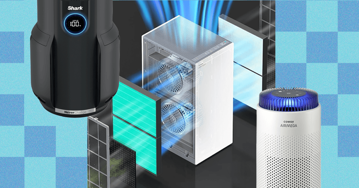
- Quantitative Confusion (PM2.5 vs. Scores): Displays showing actual PM2.5 readings (e.g., “µg/m³”) are valuable as they provide granular data. However, models using proprietary scores, like Shark’s “100 = Good Air,” create dangerous misinterpretations. Critically, 100 µg/m³ of PM2.5 is actually “Unhealthy” on the EPA scale. This potential for confusing a high numerical score with “good” air quality undermines trust and informed action.
Comparing Air Purifier Light Standards (EPA vs. Common Deviations)
| AQI Condition | EPA Standard Color | Coway Example | Shark Example (Score) | Dyson Example |
|---|---|---|---|---|
| Good | Green | Blue | 100 | Blue |
| Moderate | Yellow | Green | 80-99 | Turquoise |
| Unhealthy (Sensitive) | Orange | Amber/Yellow | 60-79 | Amber |
| Unhealthy (All) | Red | Red/Orange | 40-59 | Red |
| Very Unhealthy | Purple | Purple | 20-39 | Purple |
| Hazardous | Maroon | n/a | 0-19 | n/a |
Note: This table highlights the potential confusion from non-standard displays compared to the universal EPA guideline. (Source interpretations based on WIRED testing observations).
Noise, Size, and Power: The Balancing Act of Real-World Performance
Labeling claims create a minefield for consumers. Misunderstood room size recommendations and underestimated noise levels turn powerful purifiers into ineffective ornaments or frustrating nuisances.
- The Air Exchange Imperative: This is the core metric manufacturers obscure. ANSI/AHAM AC-1 standards measure clean air delivery rate (CADR), but listing a room size (e.g., “Covers 500 sq ft”) typically means the unit can achieve just one air exchange per hour at max speed. The CDC, however, recommends five air changes per hour for effectively reducing airborne contaminants like viruses. This means:
- For a 200 sq ft room, your purifier must clean 200 sq ft x 5 = 1000 cubic feet of air per hour at your preferred noise level. A unit rated for 200 sq ft at max (loud) speed might only manage one exchange per hour quietly. Prioritize CADR rated well above your room’s volume. Undersized “cute” tabletop units rarely deliver meaningful purification.
- Decibel Deception: Manufacturers often understate noise, or list levels only at the quietest (and often ineffective) settings. Independent verification is crucial:
- 40-50 dB: Background hum (like a fridge) – Highly tolerable for sleep.
- 60 dB: Conversational level – Often disruptive in quiet settings like bedrooms or offices.
-
65 dB: Becomes actively annoying, often causing users to turn down the fan, compromising air quality. A unit needing max speed (and high noise) to achieve CDC-recommended exchanges in your room is a design flaw.
- The Unintended Consequences: If a purifier is too loud at effective speeds, users limit its performance, transforming it into a “wellness prop.” Poor intake design can also cause clumping of pet hair on external vents – inelegant proof of airflow limitations. Units failing these practical appliance usability tests rarely justify their cost.
In Conclusion: Performance is Holistic
Choosing the right air purifier requires looking beyond marketing claims about particle capture alone. A truly effective unit harmonizes filtration efficiency with fundamental usability: it must be physically manageable (especially for larger models), offer seamless connectivity and clear information (especially on filter life and air quality), present accurate, intuitive feedback via standardized displays, and operate effectively at tolerable noise levels in your specific space. Features aimed at accessibility and ease of use aren’t luxuries; they determine whether a technologically advanced air purifier becomes a functional tool integrated into daily life or an expensive obstacle gathering dust. Investing in a unit that excels in these less-hyped aspects pays dividends in long-term satisfaction, consistent use, and genuine indoor air quality improvement for every member of your household.
What’s your biggest frustration with air purifiers – confusing displays, noise, moving heavy units, or something else? Share your experiences in the comments below!
Sources & Further Reading:
Original article at www.wired.com


