
Google Calling Cards: Rewriting the Rules of Contact Personalization (And Why It’s Not Apple’s Model)
Introduction
How many times have you stared at a generic contact icon during a call, wishing your phone showed something more personal than a name and number? What if you could decide how every contact appears on your screen—not with pre-set options, but with your own creative flourish? Google Calling Cards, a feature actively rolling out in the Google Contacts and Phone apps, flips contact personalization on its head. Unlike Apple’s “Contact Posters” (focused solely on presenting yourself to others), Google’s approach empowers you to design bespoke visual profiles for your contacts. This fundamental difference redefines control, aesthetics, and functionality in mobile communication. Let’s explore why this unexpected divergence matters.
What Are Google Calling Cards? Android’s Visual Revolution
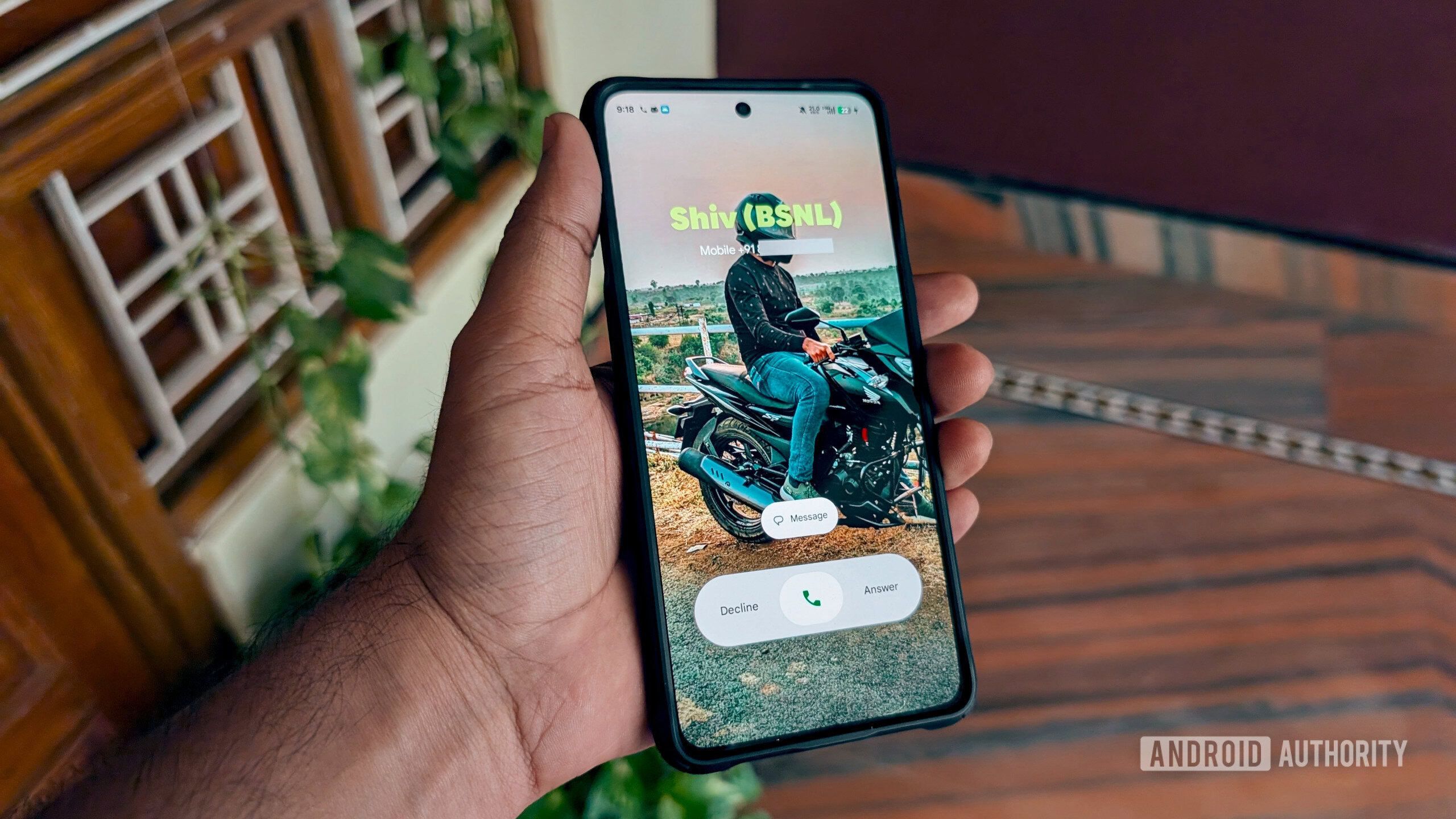
The latest beta versions of Google Contacts (v4.61.28.792249534) and Google Phone (v188.0.793710089-publicbeta-pixel2024) have unveiled the highly anticipated “Calling Cards.” Users reporting access via beta channels and Telegram confirm its active deployment. But what are these digital profiles?
- Definition: A Calling Card is a customizable visual identity for your contacts, appearing on your incoming/outgoing call screen.
- Elements: It features a customizable background image (from your camera roll, gallery, or Google Photos) and stylized text (font, color for the contact’s name).
- Scope: You create these cards for your contacts, visible only on your device—synced seamlessly via your Google account.
Critically, this isn’t about branding yourself; it’s about personalizing your view of others. It transforms contacts from static text entries into dynamic visual anchors, echoing how human memory operates better with image association than alphanumeric data (Psychological Science, 2015).
Google vs. Apple: A Philosophical Clash in Contact Customization
The most intriguing aspect of Calling Cards lies in its inversion of Apple’s “Contact Posters,” introduced in iOS 17. Let’s dissect this critical divergence:
| Feature | Google Calling Cards | Apple Contact Posters |
|---|---|---|
| User Control | Design cards for your contacts | Design your own card for others |
| Visibility | Only affects your device | Broadcasts to others’ devices |
| Purpose | Personal organization, visual recall | Self-expression, public branding |
| Psychological Frame | “How I see my world” | “How the world sees me” |
This table highlights a core philosophical split. Google prioritizes localized user experience, acknowledging fragmented recall needs (“I need HR’s Jane to look professional, college pal Jane with a party pic“). Apple prioritizes user-centric identity control (“I want colleagues to see my headshot, friends my vacation pic“). Neither is inherently superior, but they solve distinct problems. Google empowers self-curated context, crucial for users juggling personal/professional realms.
Hands-On: How to Create a Calling Card (Step-by-Step)
Based on live observations, Creating a Calling Card is straightforward:
- Trigger: Open the Google Contacts app → Select a contact → See the “Add Calling Card” prompt.
Alternatively: Add/Edit Contact → Select “Add Calling Card.” - Image Selection: Choose a source—Camera, Gallery, or Google Photos.
- Styling:
- Pick a font style (e.g., modern, classic, playful) and color palette for the contact’s name.
- Optional: Set this Calling Card as the primary contact picture (or skip this step).
- Sync: Save → Changes appear globally across devices signed into the same Google Account.
In the Phone app, a “Get Started” prompt appears, while the Settings tab tracks which contacts have cards.
💡 Pro Tip: Assign distinct color themes for categories (e.g., green for family, blue for work). This leverages pattern recognition for quicker mental indexing during calls!
Why This Matters: Beyond Aesthetics
The impact of Calling Cards extends beyond eye candy:
- Cognitive Efficiency: Visual association drastically reduces time to recognize callers. Neuroscience research confirms people identify images 60,000x faster than text (MIT, 2014). Forget “John M.? Sales or IT?”
- Professional Utility: Customize backgrounds/flags for key clients or international contacts, reinforcing contextual memory during pressure calls.
- Accessibility Support: Using high-contrast fonts/colors aids visually impaired users, aligning with Google’s Material Design accessibility guidelines.
- Social Nuance: Assign nostalgic photos for old friends versus formal shots for professional network—tailoring without notifying the contact.
This represents Android’s broader history of functional personalization. Tools like Live Wallpapers, custom launchers, and the Material You theming engine focus inward—adapting the device to the user’s operational habits.
Challenges, Privacy, and the Road Ahead
No innovation is flawless, and Google’s approach raises valid questions:
- Privacy Gray Areas: Could offensive images/insensitive edits be misused?
- User Confusion: Users may expect reciprocity (like Apple’s model), not realizing their edits are private. Clear tutorials are vital.
- Cross-Platform Gaps: If your contact uses iOS, their Apple Poster remains unseen on your Android. Fragmentation persists.
Experts lean toward judgment asymmetry: while we meticulously control self-presentation (Apple), we intuitively believe we own our “view” of others too (Google’s bet). If successful, this could inspire Meta or LinkedIn to adapt similar layers to communication apps.
Conclusion
Google Calling Cards don’t just add flair—they restructure contact management around your visual language. By decoupling customization from reciprocity (unlike Apple’s Contact Posters), Google targets personal utility over social signaling. This reflects a deepening prioritization of mindful user experience interoperability within the Android ecosystem. While the beta rollout remains limited, its potential to reshape our cognitive relationship with digital connections is vast. Will you use customizable colors to segment clients? Assign decade-old photos for nostalgia? Or prioritize utilitarian functionality? As contact management evolves from directories to dynamic interfaces, Google Calling Cards offer a uniquely personal lens.
What would your first Calling Card design be for your most-called contact? Share your creative vision below! #AndroidUX #GoogleCallingCards
Sources & Further Reading:
Original article at www.androidauthority.com


